

Scarcity is one of the most powerful engagement levers we have. It is also the easiest to abuse. Here is how to use it without becoming the villain of your own product.
BRIEFING
FOMO works because of how the brain handles loss, not because your users are greedy.
Used well, it rewards your most engaged people and gives your product a heartbeat.
Used badly, it becomes a deceptive pattern that quietly burns trust, and increasingly it breaks the law.
This piece draws a clear line between the two, backs it with real cases, and gives you five design rules plus a 30 second gut check.
You have felt it. The "Only 2 rooms left at this price" banner. The countdown timer ticking on a checkout page. The limited time skin that vanishes from the shop at midnight. That little jolt of "act now or lose it" is FOMO, the fear of missing out, and it is one of the most effective engagement mechanics we have.
It is also one of the fastest ways to earn a one star review, a wave of churn, or a reputation you spend years repairing. So let us do the useful thing: understand why it works, then engineer it so it serves your users instead of ambushing them.
Why FOMO actually works (it is your brain, not a trick)
Three well documented forces sit behind that jolt.
- Loss aversion. In the prospect theory of Daniel Kahneman and Amos Tversky, losses hurt more than equivalent gains feel good. Their later work put the ratio at roughly 2.25 to 1, which is why "you will lose your streak" lands harder than "come earn some points." Missing out reads to the brain as losing, not as failing to gain.
- The scarcity principle. Robert Cialdini showed that we assign more value to things that are rare or fleeting. Scarcity is a mental shortcut for "this must be worth it."
- The attention economy. As UX scientist Celia Hodent writes in Dans le cerveau du gamer, every product now competes for the same finite resource: human attention. Honest, well timed urgency is one fair way to earn a slice of it.
Notice what is absent from that list: deception. FOMO is not inherently manipulative. It is a rhythm. Fortnite's rotating item shop, Spotify's once a year Wrapped, Supercell's seasonal events, a bakery's Saturday only special: all of them use scarcity, and none of them are scams. The mechanic is neutral. Your intent is what turns it into a gift or a trap.
The line: nudge versus deceptive pattern
Here is the cleanest definition of the wrong side. Celia Hodent describes a deceptive pattern (long known as a "dark pattern") as design that is intentionally deceptive and not built in the user's interest, engineered to maximise the company's revenue at the user's expense. Her test is blunt and useful: the moment you put the business ahead of your audience, you have stopped doing UX.
A note on vocabulary: Harry Brignull coined "dark patterns" in 2010. He now prefers "deceptive patterns," and his catalogue lives at deceptive.design. The idea is identical; the newer label is simply clearer.
The opposite of a deceptive pattern is a nudge, a term from economists Richard Thaler and Cass Sunstein: a gentle push that helps the user make a choice that is good for them. Same psychology, opposite allegiance.
So the real question is never "is FOMO manipulative?" It is "is this specific urgency true, and who does it serve?"
- A real limited event, a genuine deadline, a truly finite stock: honest scarcity, a nudge.
- A timer that resets when you refresh, a "1 left!" that is always "1 left," a "23 people are looking right now" pulled from nowhere: manufactured scarcity, a deceptive pattern.
Fake urgency does more than annoy people. It is the fastest way to turn a curious user into a suspicious one.
WATCH OUT
The moment a user catches one fake timer, or a "1 left" that is always "1 left," they stop trusting all of your urgency, and usually the rest of your product with it.
You do not just lose that one moment, you burn the credibility that makes every future nudge work.
Manufactured scarcity is the rare tactic that gets weaker the more people notice it, and people always notice. If your growth lever needs a lie to work, it is not a lever, it is a slow leak.
It is a spectrum, not a switch
Most real mechanics live in a grey zone. The job is to know which way you are sliding.
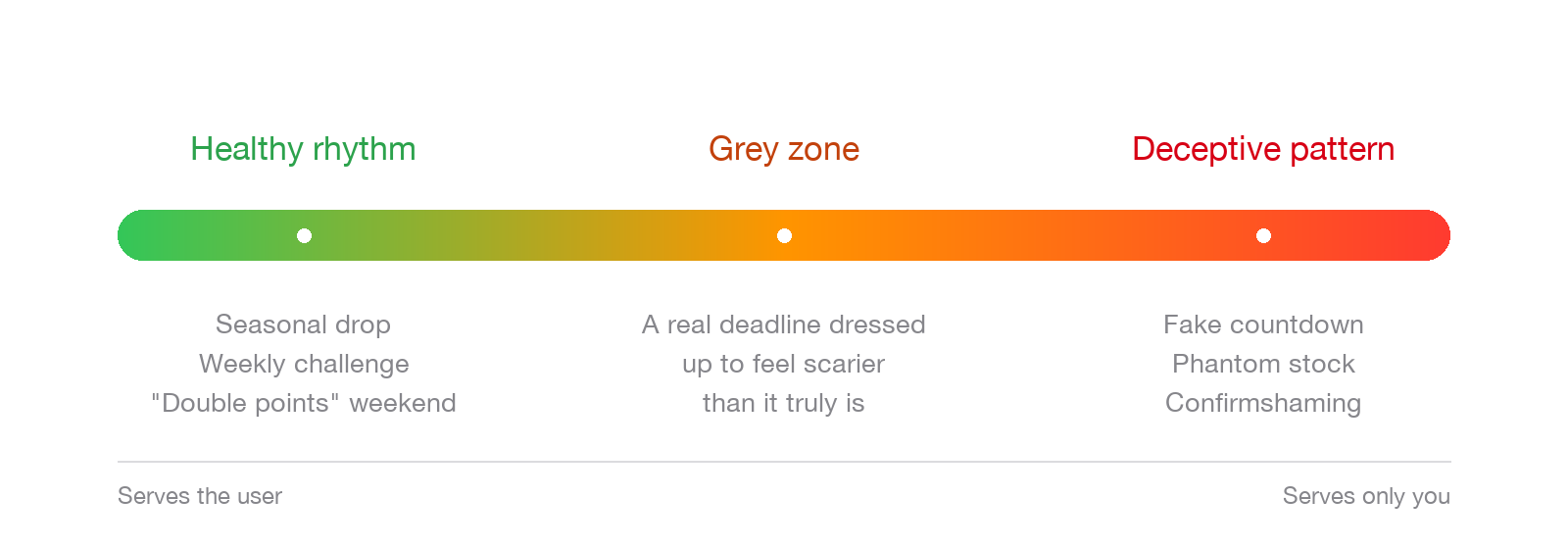
The Ethical FOMO spectrum. The same mechanic can sit anywhere on it; design decides where.
- Healthy rhythm: a weekly challenge, a seasonal cosmetic drop, a "double points" weekend, honest early access for members.
- Grey zone: a real deadline dressed up to feel more frightening than it is, or a "limited" run that quietly restocks next month without saying so.
- Deceptive pattern: fake timers, phantom stock, confirmshaming ("No thanks, I hate saving money"), or an exit that is deliberately hard to find.
How to design ethical FOMO: five rules
1. Make the scarcity real, and make recurring scarcity honest
If the deadline is real, good. If the "limited" thing comes back every month, say so ("Back next season"). People forgive recurrence. They do not forgive being lied to, and honesty about the cadence is what turns a one time trick into something they look forward to.
2. Reward the engaged, do not punish the absent
This is the big one, and it is where most loyalty apps trip. FOMO should feel like a bonus for showing up, never a penalty for having a life. Hodent flags the ethics of daily login mechanics right here: if skipping a day destroys progress the user already earned, you have built a guilt machine, not an engagement loop. Frame the moment as an opportunity ("today's bonus is live") rather than a threat ("do not lose your 40 day streak").
3. Keep the exit obvious and cheap
The clearest signal of good faith is an easy "no." No hidden opt-out, no confirmshaming, no pre-ticked boxes. Hodent's textbook example is the newsletter that switches to opt-out so distracted users get subscribed by default: that is the exact moment UX becomes a deceptive pattern. If leaving is harder than joining, you are on the wrong side.
4. Never wire chance based rewards to real money for vulnerable users
Variable rewards, the unpredictable payoffs behind a loot box, are genuinely engaging and perfectly fine on their own. Board games have used dice and card draws for generations. But Hodent is unambiguous: tying chance based rewards to real money is ethically questionable in general, and clearly unacceptable in products aimed at children. If your urgency nudges minors toward a spend to gamble mechanic, stop.
5. Give it a heartbeat, not a heart attack
Constant urgency is just noise, and noise causes churn. Scarcity works because it is occasional. Tie it to a cadence, a weekly window or a seasonal event, so the pressure has rhythm and rest. A product that screams "LAST CHANCE" every single day has trained its users to ignore it.
Taking it out of the game: three business patterns
You do not need a game to use any of this. The same rules map straight onto everyday products.
- Loyalty or training program. Ethical move: seasonal "double points" windows framed as a thank you. The trap: points that expire and punish loyal customers for pausing.
- E-commerce or launches. Ethical move: honest limited runs and genuine early access for members. The trap: phantom stock counters and resetting timers.
- SaaS onboarding. Ethical move: a time-boxed setup bonus framed as a head start. The trap: "your data will be deleted" guilt trips during a trial.
And here is the strategic payoff: done right, ethical FOMO is a retention lever, not just an acquisition trick. In Nicholas Lovell's The Pyramid of Game Design, retention is the one metric you actually control, and appointment mechanics, reasons to return at a specific time, are among his core retention tools. His rule of thumb for healthy retention is roughly 40 percent next day, 20 percent at seven days, and 10 percent at thirty days. A respectful rhythm of events defends those numbers. A manipulative one spikes today's chart and craters next month's.
KEY TAKEAWAY
Ethical FOMO does not ask "how do I make them afraid to leave?" It asks "how do I give my most engaged users a reason to be glad they showed up?"
The 30 second gut check
Before you ship any urgency mechanic, run it through these five questions. One "no" is a yellow flag. Two is a stop sign.
- Is the scarcity true? (Real deadline, real stock, real event.)
- Does missing out cost the user something they already earned? If yes, you are punishing, not rewarding.
- Could you explain the mechanic to the user's face without flinching?
- Is the opt-out at least as easy as the opt-in?
- Does it serve the user's goals too, or only yours?
Pass all five and you have urgency that builds trust instead of spending it. That is the whole game: engagement people thank you for, not engagement they feel tricked into.
Glossary
FOMO (Fear Of Missing Out). the anxiety that a rewarding opportunity is happening without you. Powerful because the brain treats missing out as a loss.
Loss aversion. a cognitive bias (Kahneman and Tversky) where losses feel roughly 2.25 times as painful as equivalent gains feel good. The engine under most FOMO.
Scarcity principle. Robert Cialdini's finding that people value things more when they are rare, limited, or time bound.
Dark pattern / deceptive pattern. design that is intentionally deceptive and not in the user's interest, used to extract money or actions at their expense. Coined by Harry Brignull, who now prefers "deceptive pattern."
Nudge. a gentle, benevolent design cue (Thaler and Sunstein) that helps users make a choice that is good for them. The ethical twin of a deceptive pattern.
Attention economy. the idea that human attention is a scarce, finite resource that products compete for. Ethical design earns it; deceptive patterns steal it.
Appointment mechanic. a reason to return at a specific time, such as a daily bonus or a weekly event. A core retention tool: powerful as a reward, toxic as a punishment for absence.
Variable reward. an unpredictable payoff, like a loot box. Fine on its own, ethically fraught when chance based rewards are tied to real money, especially for children.
Confirmshaming. guilt based wording on an opt-out ("No thanks, I hate saving money") meant to shame someone out of declining.
Ready to build urgency your users actually trust?
Gamification only works when the mechanics respect the human on the other side of the screen.
If you want an outside eye on where your product is nudging, and where it might be quietly slipping into a deceptive pattern, that is exactly what I do.