
Engagement is not a feature you bolt on at the end. It lives in the tiny moments of feedback, guidance and progress that most products leave on the table. Here is how games win those moments, and how your product can too.
BRIEFING
A boring product is rarely a boring idea. It is usually an interface that gives nothing back. Games have spent decades learning to answer four questions in the corner of your eye, every second: what can I do, did it work, where am I, and is this worth continuing. This is a deep look at the five interface habits that answer those questions, the psychology that makes them work, and how to borrow them for your own app or platform without turning into a slot machine.
Think about a health bar. You have seen thousands of them, and you have probably never once stopped to admire one. That is exactly why it is a small masterpiece. In a single strip of colour it tells you your current state, how close you are to disaster, whether that last hit actually mattered, and whether to push on or retreat, and it does all of it at the edge of your vision while your attention is somewhere else. No text. No menu. No thinking. Just an instant, honest read on where you stand.
Your product has a health bar too. It might be a progress ring, a notification dot, a gentle animation when something saves, or the dead silence where those things should be. Every screen your users touch is quietly answering questions for them, whether you designed those answers or not: Can I do something here? Did that work? Where am I? Is this worth continuing? Games have spent forty years learning to answer those questions beautifully. Most business software still leaves them hanging.
So let us be clear about what this article is and is not. It is not about bolting points and badges onto a dashboard. That is the visible, and often the least important, layer of gamification. This is about the layer underneath it: the moment-to-moment feel of an interface, which is where engagement is actually won or lost. Get it right and a dull tool becomes something people reach for out of habit. Get it wrong and no amount of confetti on top will save it.
For the user, the interface is the product
There is a hard truth that every game designer internalises early and most software teams never quite do: the user does not experience your architecture, your roadmap, or your clever backend. They experience the surface. The interface is not a window onto the product. To the person using it, the interface is the product.
That means engagement is not a separate feature you can schedule for next quarter. It is a property of how the surface behaves under a fingertip, right now. A game with brilliant systems and a lifeless, unresponsive interface feels broken. A modest game with a surface that responds, guides and rewards feels alive. The same is true of a banking app, a training platform, or an internal tool nobody was supposed to enjoy. The difference between "I have to use this" and "I want to use this" is usually not the idea. It is the feel.
Habit 1: Every action deserves a reaction
Start with the most basic promise an interface can make, the one games never break and software breaks constantly: if the user does something, something visibly happens.
UX scientist Celia Hodent, who led player experience at Epic Games, treats this as a foundational pillar she calls signs and feedback. A system, she argues, has to communicate two things continuously: its current state, and what actions are possible. And the instant a user acts, they need a response that is fast, clear and perceptible. When that feedback is missing or muddy, you do not get calm patience. You get confusion, doubt, and the little rage of a person tapping a button three more times because they cannot tell if the first tap did anything.
You have lived this. The form that submits with no confirmation, so you resubmit and create a duplicate. The button that does not depress, so you are not sure it registered. The upload with no progress, so you assume it froze and start over. Every one of those is a missing reaction, and every one quietly erodes trust. In a game it would be unthinkable: imagine swinging a sword and seeing nothing happen, no motion, no sound, no hit. You would call it a bug. In software we call it Tuesday.
Good feedback does four jobs at once. It confirms that the system heard you. It teaches you what just happened and what to expect next. It reassures you that things are under control. And, done well, it delights, which is where the next habit comes in. The baseline, though, is non-negotiable: no action without a reaction.
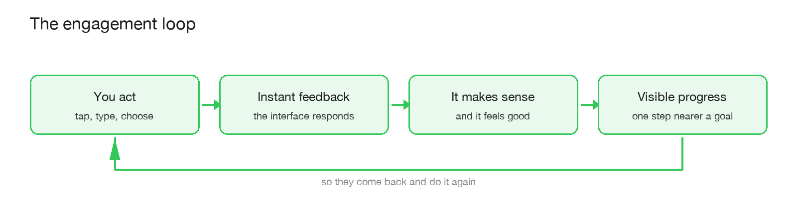
The engagement loop. Feedback is not decoration; it is the mechanism that turns a single action into a habit.
Habit 2: Make the reaction feel good (juice)
Functional feedback keeps a product from feeling broken. Feedback that feels good is what makes a product feel alive, and game developers have a blunt word for it: juice. In his book Game Feel, designer Steve Swink describes how the sensation of controlling something comes not just from the mechanics but from the layers of response wrapped around every action: the little animation, the sound, the shake, the particle, the haptic buzz. None of it changes what the action does. All of it changes how the action feels.
There is a well-worn mantra among game developers, "juice it or lose it," from a 2012 talk by Martin Jonasson and Petri Purho, and its lesson travels straight into ordinary software. The same button press can feel dead or delightful depending entirely on the response you wrap around it. A task that slides off the list and ticks with a soft sound. A number that counts up instead of just appearing. A pull-to-refresh that has a bit of spring to it. Apple built a whole language of tiny haptic taps for exactly this reason. Mailchimp famously rewarded users who sent a campaign with a cartoon high-five, turning the scariest moment in the app, hitting send on an email to thousands of people, into a small celebration.
Two cautions keep juice from backfiring, and skipping them is where amateurs go wrong. First, juice amplifies, it does not fix. A satisfying animation on a confusing flow just makes the confusion prettier. Get the feedback correct before you make it pleasurable. Second, more is not better. Hodent warns that firing every sign and animation at once overwhelms working memory and turns a clear screen into noise. The best juice is felt more than noticed. If your users are consciously admiring your animations, you have probably used too many.
Habit 3: Guide the eye to the next thing
An engaged user is almost never a confused one. The fastest way to lose someone is the silent, deflating moment of landing on a screen and thinking, "okay, now what?" Games obsess over eliminating that moment. They are constantly, invisibly, answering the question "where do I look, and what can I do here?" through contrast, motion, light, and placement, so the next action feels obvious before the player has consciously looked for it.
The vocabulary for this comes from design theorist Don Norman, and Hodent leans on it throughout her work: affordances and signifiers. An affordance is what an object lets you do; a signifier is the visual cue that advertises it. A button that looks pressable, a handle that looks pullable, a field that looks fillable. "Form follows function": the look of a thing should tell you what it does. When that link breaks you get a false affordance, something that looks interactive but is not, or looks like one thing and does another, and Norman's research shows how reliably that frustrates people. The flat design era is littered with false affordances: text that looks like a button, buttons that look like text, and users left poking at the screen to find out which is which.
Practically, guiding the eye means giving every screen a clear visual hierarchy and one obvious primary action. It means designing your empty states, the blank screen a new user sees before they have any data, as a friendly nudge toward the first step rather than a dead end. It means using motion sparingly to draw attention to what changed. And it means onboarding that shows rather than tells, letting people learn your product by doing one small successful thing, then the next. Every time you remove a "now what?" you keep a user in the flow instead of sending them to the exit.
Habit 4: Show progress, because progress is a drug
If there is one engagement lever that is both wildly effective and wildly underused in business software, it is visible progress. Humans are almost helplessly motivated by a goal they can see themselves approaching, and the research on this is old, deep and remarkably consistent.
The core finding is the goal-gradient effect: motivation and effort increase as the perceived distance to a goal shrinks. It was first documented in 1932 by Clark Hull watching rats run faster near the end of a maze, and it was confirmed in humans in a landmark 2006 study by Kivetz, Urminsky and Zheng. In their coffee-shop experiment, customers bought coffee faster the closer their loyalty card got to a free drink. The detail that should make every product manager sit up: a card that needed 12 stamps but came with 2 already filled in was completed noticeably faster than a card that needed 10 stamps from scratch, roughly 12.7 days versus 15.6, even though both required the same 10 purchases. The finish line had not moved. Only the feeling of proximity had.
That pre-filled head start has its own name, the endowed progress effect (Nunes and Dreze, 2006), and it is why the best onboarding flows never start you at zero. "Create your account" is quietly reframed as "you are already 20% of the way to a complete profile." LinkedIn built a business partly on a profile-strength meter that made your own incompleteness itch. Fitness apps close rings. Duolingo dangles a streak you do not want to break. Every one of them is running the same play: make the goal visible, make progress toward it visible, and let the goal-gradient effect do the rest.
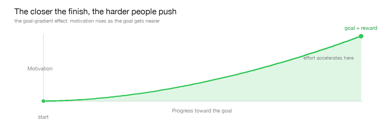
The goal-gradient effect: the nearer the reward feels, the harder people work for it. Your job is to make that nearness visible.
Two design details make a large difference here. First, frame progress as distance covered, not distance remaining. "8 of 10 complete" pulls harder than "2 left," because it emphasises accumulated investment. Second, respect the Zeigarnik effect, the well-documented tendency for unfinished tasks to stay lodged in our minds. A checklist with one item left undone is a small open loop your user will feel a quiet pressure to close. A progress bar is not a decoration. It is a promise your user makes to themselves.
Habit 5: Say everything at a glance
The last habit is the one Bobby's world of games lives and dies by: communicating state instantly, without words, so the user always knows what is going on without having to stop and read. Icons, badges, colours, dots and meters are a language, and games are fluent in it. A red glow means danger. A gold border means rare. A pulsing marker means "go here." A number on an icon means "this many things need you." None of it requires a sentence.
Business software often defaults to the opposite: walls of text and status buried in menus. Borrowing the game approach means letting a well-chosen icon carry a status, a colour carry urgency, a badge carry a count, and a subtle change of state carry the message "something here is new." Hodent's advice is worth taking literally: test your iconography, because an icon that is obvious to you is often a riddle to your users, and lean on the Gestalt principles of perception, the way our brains automatically group, separate and prioritise what they see, so the important thing reads as important without anyone straining.
All of this serves a single deeper goal: keeping cognitive load low. The UX writer Steve Krug summed up two decades of usability research in one title, Don't Make Me Think, and Hodent echoes it: anything that makes a user stop and consciously work out what your interface means is friction, and friction is where engagement leaks away. Our working memory is tiny and easily swamped. Every status you can show at a glance is a thought you have spared your user, and a reason for them to stay in the experience instead of stepping out of it to figure things out.
The honest line: feedback that serves, not feedback that tricks
Everything above is powerful, which means it can be abused, and this is where a lot of "gamified" products lose the plot. The same progress bar that motivates can be faked to mislead. The same feedback that reassures can be twisted into a guilt trip. A loading spinner that is artificially slowed so your service seems to be "working hard." A progress bar that is really just a timer. A red badge manufactured to pull an anxious tap. These are the interface cousins of the dark patterns I wrote about in the ethical FOMO piece, and they carry the same long-term cost: the first time a user senses the feedback is lying, they stop trusting all of it.
The test is simple and it is the same one that runs through everything Only One Concept builds. Does this feedback serve the user's understanding, or only your metrics? An endowed-progress head start that leads to a reward the user genuinely wanted is a kind, effective nudge. A fake progress bar that leads nowhere is a small lie you will pay for in churn. Honest feedback is not just the ethical choice. On any timeline longer than a quarter, it is the effective one.
A five-minute audit of your own product
You do not need a redesign to start. Take the three or four actions that matter most in your product, the ones you most want people to complete, and walk each one slowly while asking five questions.
- Did something visibly happen? The moment the user acts, is there an immediate, clear response, or a suspicious silence?
- Did it feel good? Is the response merely functional, or is there a little life to it that makes the user want to do it again?
- Is the next step obvious? After this action, does the eye land naturally on what to do next, or is there a "now what?" gap?
- Can they see progress? Is there a visible sense of moving toward something worth reaching, framed as ground gained?
- Can they read the state at a glance? Without reading a word, does the user know what is happening and what needs them?
Every "no" is not a flaw to be ashamed of. It is an unclaimed piece of engagement sitting in plain sight, usually fixable in an afternoon, and almost always cheaper than the next feature on your roadmap.
KEY TAKEAWAY
Engagement does not live in the features you add. It lives in how the interface answers, every second, four quiet questions: what can I do, did it work, where am I, and is this worth continuing. Answer them well and people stay without being able to tell you why.
WATCH OUT
Feedback, progress and juice are persuasion tools, and persuasion tools can be pointed the wrong way. The moment a user catches your interface exaggerating, faking a progress bar, inventing an alert, dressing up a delay as effort, they discount everything else it tells them. Design these mechanics to make the truth clearer and more rewarding, never to bend it. Trust is the one resource an interface cannot animate its way back.
Glossary
Signs and feedback. Celia Hodent's usability pillar: an interface must always communicate its state and the actions available, and respond quickly and clearly to every input.
Juice. the layers of response (animation, sound, motion, haptics) wrapped around an action to make it feel satisfying, without changing what it does. From game design; see Steve Swink's Game Feel.
Affordance. what an object lets you do (a button affords pressing). A concept from designer Don Norman.
Signifier. the visible cue that advertises an affordance, the thing that makes a button look pressable.
False affordance. an element that looks interactive but is not, or looks like one thing and does another. A reliable source of user frustration.
Signposting. using hierarchy, contrast and motion to guide the eye to the next action so the user never has to hunt for it.
Goal-gradient effect. motivation rises as the perceived distance to a goal shrinks (Hull 1932; Kivetz, Urminsky and Zheng 2006). The reason visible progress drives completion.
Endowed progress effect. giving a head start toward a goal (a pre-filled progress bar) makes people more likely to finish (Nunes and Dreze 2006).
Zeigarnik effect. the tendency to remember and feel pulled to complete unfinished tasks. Why an incomplete checklist nags at you.
Cognitive load. the mental effort an interface demands. Keep it low, because working memory is small and easily overwhelmed (see Steve Krug, Don't Make Me Think).
HUD (heads-up display). the layer of always-visible status information, like a health bar, that lets a user read their state at a glance.
Is your product boring, or is it just quiet?
Most "engagement problems" are really interface problems: actions with no reaction, progress no one can see, states buried in menus.
I help teams find those leaks and design the feedback, guidance and progress that turn a tool people tolerate into one they choose. If your platform should be stickier than it is, that is the conversation to have.